The Hurricane Group
Case Study
- Logo
- Web Design
- Web Development
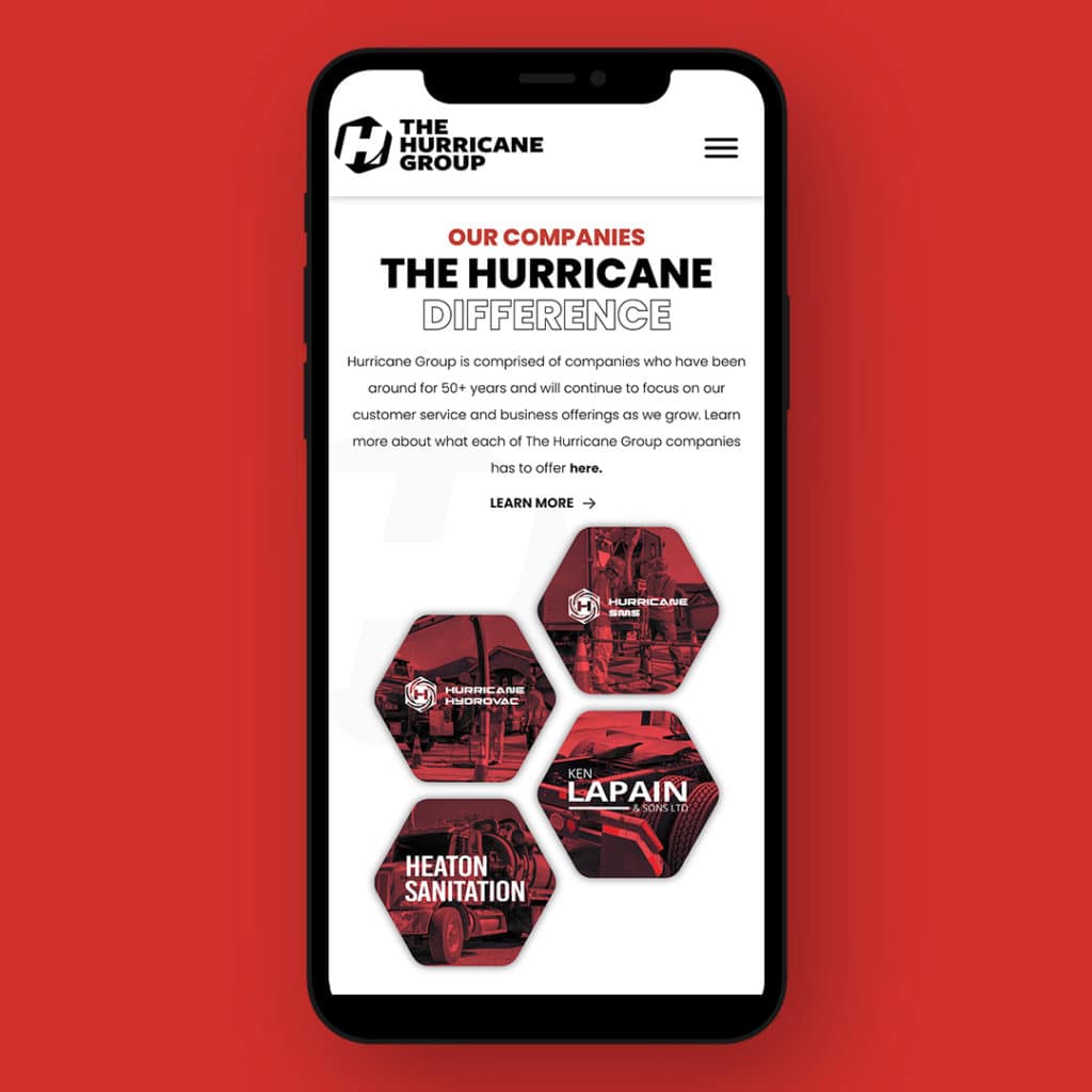
The Hurricane Group is comprised of four companies located in Southern Ontario. Hurricane Hydrovac, Heaton Sanitation, Ken Lapain & Sons Ltd, and Hurrican SMS are each known for being the best in their industry, and together are a powerhouse to be reckoned with. The leadership team for The Hurricane Group was looking to update their web presence and recognized at the time that it was an excellent opportunity to update their brand also. They wanted to ensure that their services and strength was apparent at first glance for all partners, customers, employees, and any prospects. It was also crucial for The Hurricane Group to highlight their connections between the businesses.
Visit the websiteLogo
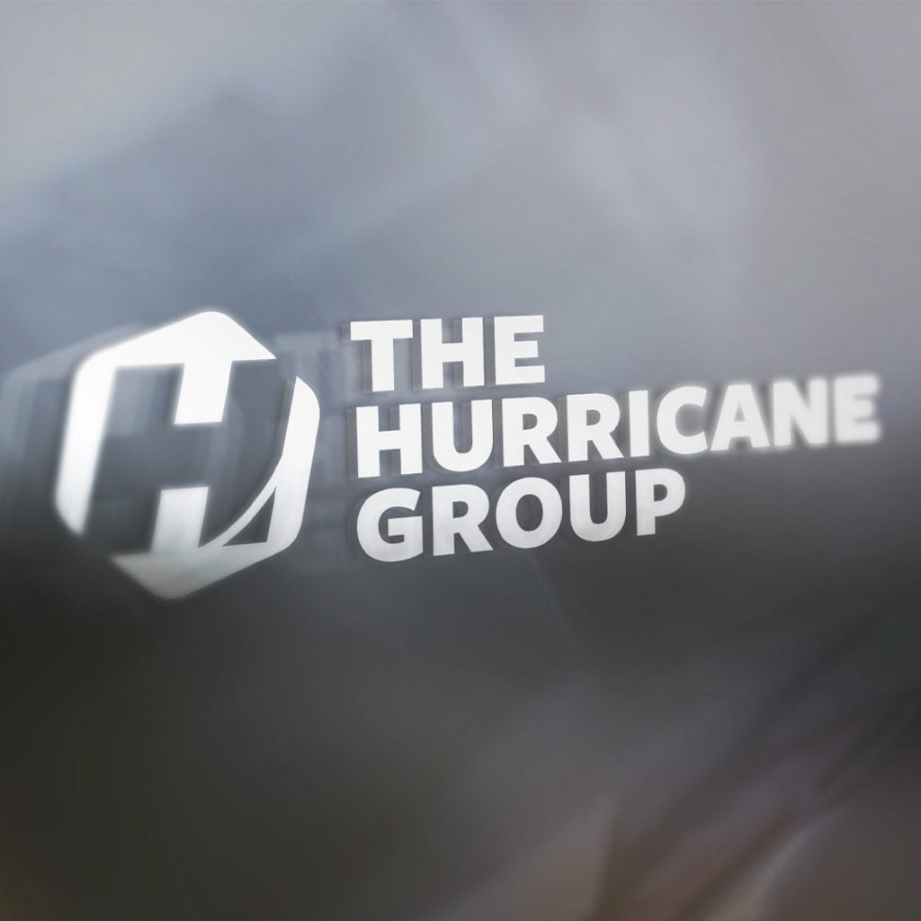
With previously established businesses to consider, when The Hurricane Group approached the Pure team about creating a new logo for the parent company, it was an exciting challenge we wanted to tackle with them. It was imperative to respect the brands in play already, but also unify the organizations under The Hurrican Group. The team was also passionate about the logo being modern, high quality, and approachable, which aligns with their mission. The Pure team used the hexagon shape for the tie into the other companies but adjusted the typography to support the parent brand. The logo is simple, clean, black and gold so that it does not take away from each business but can stand alone as a firm representative of the company.
Web Design + Dev
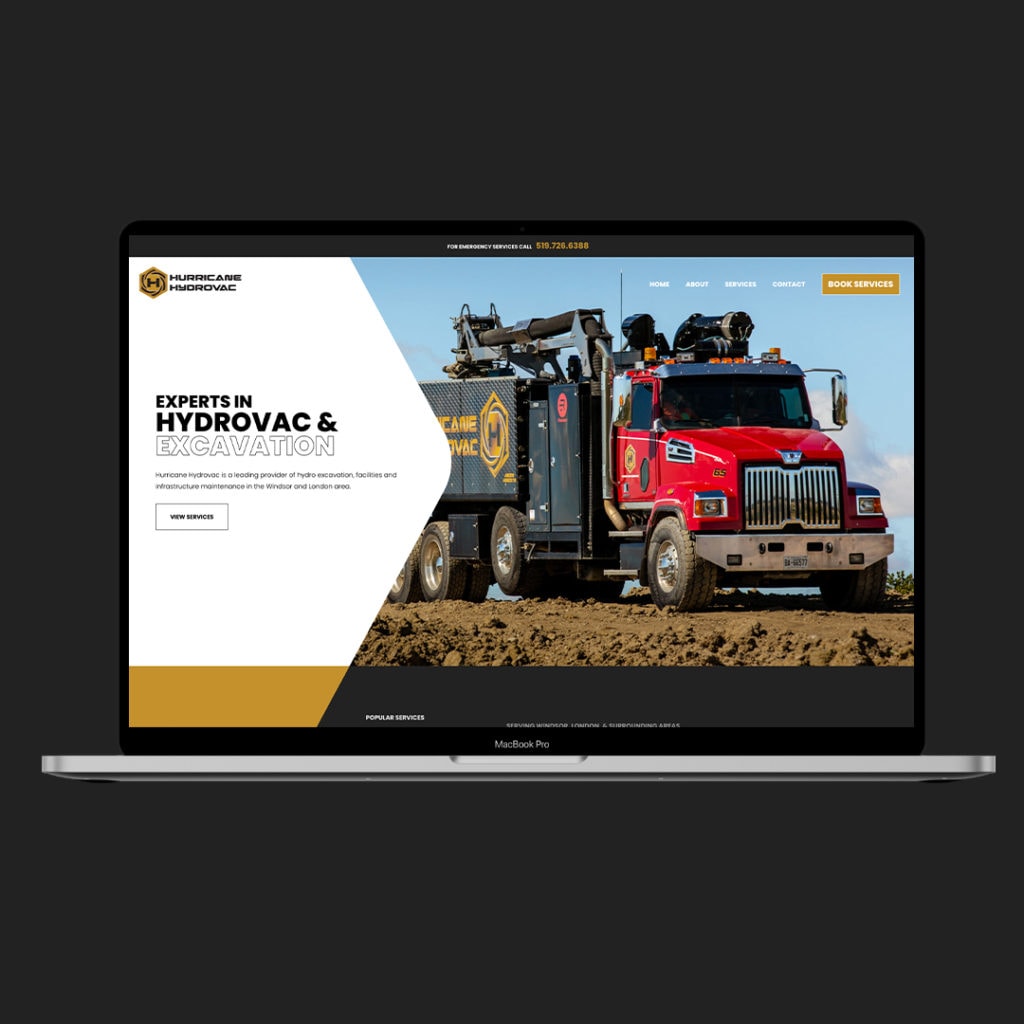
This was a large project for the Pure team to tackle with a solid customer. The task: create five new websites. When the design team got cracking, they started with The Hurricane Group main page and set it up as a landing site for the various businesses, but ensured it was also informative about the company overall. From there, the team developed wireframes for the other company sites using the previous sites as a reference but ensuring the overall brand was evident across the board. Knowing that the customer base of The Hurricane Group includes various businesses and government agencies, the websites needed to be clean, concise, responsive, mobile-friendly, and yet still informative. Using the Pure team's cunning development skills, the sites were all linked together and came out clean and modern as planned. On this project, the Pure team also got to use their skills in copywriting and creative direction around photography. Essentially, most of the crew got to have a hand in these cool sites and had a great time bringing this customer's ideas and needs to life.


